Chart 1 -- Percentage of families eating dinner together among technology owners
You can view the live version of this chart here. On that page you will be able to get a clearer view of the data and play with its organization.
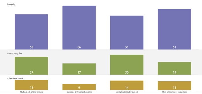
What the chart represents
This chart represents a 1,491-person sample of those who are married, living with a partner or have a child under 18 living at home. It compares how frequently they eat dinner as a family to their level of technology ownership. The data in the chart above come from the Pew Internet & American Life Project, specifically the report on networked families.
According to the report:
”Those with multiple communication devices are somewhat less likely to eat
dinner with other household members and somewhat less likely to report high levels of
satisfaction with their family and leisure time than are families with lower levels of
technology ownership.“
Chart 2 -- Parent/Child Communications
You can view the live version of this chart here. On that page you will be able to get a clearer view of the data and play with its organization.
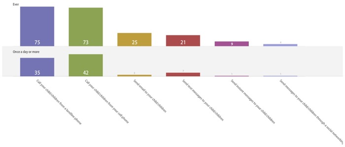
What the chart represents
This chart represents a 425-person sample of parents with a child 7 to 17 years old in the household. It compares the percentages of parents who communicate with their children using landlines, cell phones, e-mail, text messages, instant messages or social networking sites and the frequency with which they use that form of communication. The data in the chart above come from the Pew Internet & American Life Project report on networked families.
According to the report:
”As with adult-to-adult communications, cell phones and landline telephones are the primary technologies
parents use to keep in touch with their children over the course of the day.“
About these visualizations
This style of visualization is known as a matrix chart, specifically a bar chart. This type of visualization shows comparisons of multidimensional data, i.e. data that is being compared on two or more levels. In both charts, the categories being compared are frequency of technology use (vertical) and what types of technology people use (horizontal). These visualizations make it easy to compare the different frequencies of use and types of technology at a glance.
 Uploading ....