| | | |
 Uploading .... Uploading ....
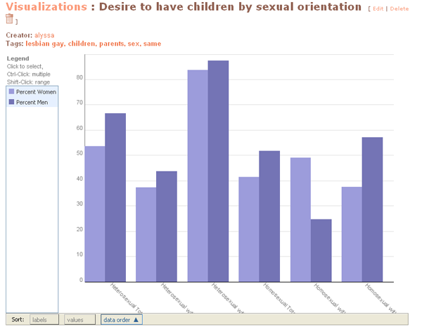
You can view the live version of this chart here. On that page you can roll over each bar to view the percentage of men or women with a desire to have children by sexual orientation.
What the chart represents
The data in the chart above comes from the National Survey of Family Growth (2002) and an article from the Urban Institute.
The National Survey of Family Growth (NSFG) is conducted by the National Center for Health Statistics, which is a part of the Centers for Disease Control and Prevention. In the past, the survey was completed every seven years, interviewing volunteers from a representative sample in person, with separate questionnaires for men and women. In 2002, the survey had a 79 percent response rate, with 12,571 respondents.
The chart represents, by percentage, the question of desire to have children posed to both men and women in the survey. The results are separated by sexual orientation, people already with or without children and by gender. Totals for sexual orientation separated by men and women are also included.
About the data visualization
This style of chart is called a bar chart. The bars show vertically the percentage in each category, which in this case represents the percentage of those who desire to have children. The highest percentages are represented by the tallest bars.
---
|
|
|
| | | |
|